

Loans for Bad Credit
A low credit score can feel like a closed door. You need to borrow money, but every rejection chips away at your confidence. The good news is that past credit problems do not have to define your future.
New Horizons connects you with lenders who look beyond your credit history. We search over 50 FCA-authorised lenders to find loans for bad credit that match your current circumstances. Our Soft Credit Match technology means you can check your eligibility without leaving any mark on your credit file.
Whether you have missed payments, defaults, CCJs, or simply a limited credit history, we work with lenders who understand that life happens. You could borrow from £50 to £5,000, with repayment terms from 3 to 36 months. There are no fees to use our service, and you are under no obligation to accept any offer.
Thousands of people use New Horizons every day to find quick loans that work for their situation. Our Feefo Gold rating reflects our commitment to doing right by our customers.

How Bad Credit Loans Work at New Horizons
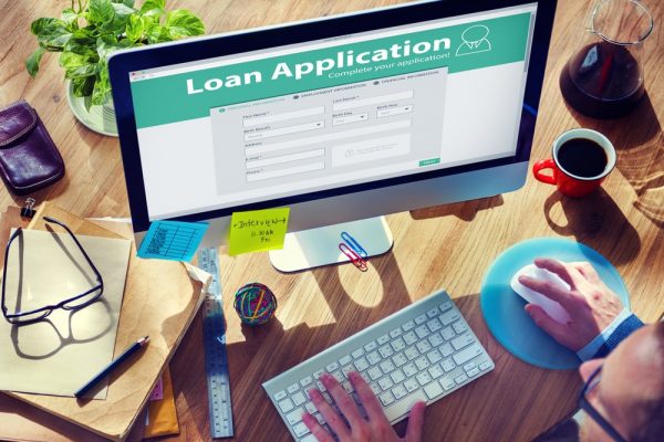
Applying for loans for bad credit through New Horizons is straightforward. The entire process takes just a few minutes, and you could have an instant decision on your eligibility.
Here is how it works:
- Complete our short online form with your personal and financial details
- We run a Soft Credit Match across our panel of over 50 FCA-authorised lenders
- If matched, you see your loan options in minutes, with no impact on your credit score
- Choose the offer that works for you, or walk away with no obligation
- If you accept an offer, the lender completes a full affordability check
- Once approved, funds could be in your account within 15 minutes
Our Soft Credit Match only shows on your credit file as a quotation search that only you can see. Other lenders cannot see it, and it will not affect your credit score. A hard credit check only happens if you choose to proceed with a loan offer.
This two-stage process protects your credit file while giving you genuine options to consider. You can compare offers and make an informed decision without worrying about rejection marks appearing on your record.
It's quick & easy
Apply for a loanWhat Counts as Bad Credit?
Bad credit is a broad term that covers many different situations. You might have bad credit if you have experienced any of the following:
- Missed or late payments on credit cards, loans, or bills
- Defaults recorded on your credit file
- County Court Judgements for unpaid debts
- Individual Voluntary Arrangements or debt management plans
- Bankruptcy in the past six years
- Multiple credit applications in a short period
- Little or no credit history at all
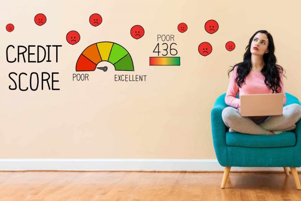
Each credit reference agency scores your credit differently. Experian uses a scale from 0 to 999, where anything below 721 is considered poor or very poor. Equifax scores range from 0 to 1000, with poor credit sitting below 531. TransUnion uses a 0 to 710 scale, where scores below 566 are classified as poor.
The key point is that a low credit score does not make you a bad person or an irresponsible borrower. Circumstances change. A redundancy, illness, divorce, or unexpected expense can affect anyone. We work with lenders who assess your current situation and ability to repay, not just your past mistakes.
If you are working on rebuilding your credit, our guide on how to improve your credit score offers practical steps you can take today.
Different Types of Bad Credit Loans


Eligibility for Bad Credit Loans
To apply for loans for bad credit through New Horizons, you need to meet some basic requirements:
- Be at least 18 years old
- Be a UK resident with a UK bank account
- Have a regular source of income
- Provide accurate contact details including email and mobile number
Your income can come from employment, self-employment, benefits, or a pension. What matters to lenders is that you have money coming in regularly and can demonstrate affordability.
Lenders will assess your income against your existing outgoings to ensure any loan repayments would be manageable. This affordability check is required by the Financial Conduct Authority to protect borrowers from taking on debt they cannot afford.
New Horizons does not charge any fees to use our service. We are paid by lenders when a loan completes, which means checking your eligibility and comparing offers costs you nothing.
If you receive benefits, you may still be eligible for a loan. Our loans for people on benefits page explains how this works in more detail.

Understanding the Costs of Loans for Bad Credit
Loans for bad credit typically come with higher interest rates than standard personal loans. This reflects the increased risk lenders take when lending to people with imperfect credit histories. Being upfront about costs is part of our commitment to transparency.
Our representative APR is 49.9%. This means at least 51% of people who successfully find a loan through New Horizons receive this rate or better. The actual rate you are offered will depend on your individual circumstances, including your credit history, income, and the amount you wish to borrow.
Rates across our lender panel range from 9.3% APR to a maximum of 1721% APR. Shorter-term loans typically have higher APRs because the interest is calculated over a shorter period.
Representative example: Amount of credit: £1,200 for 18 months at £95.44 per month. Total amount repayable: £1,717.83. Interest: £517.83. Interest rate: 49% pa (fixed). Representative 49.9% APR.
New Horizons
Before you accept any loan offer, you will see the exact amount you’d repay, broken down clearly. There are no hidden fees or surprises. If the numbers do not work for you, simply walk away.
For smaller amounts, you might consider a £500 loan or a £1,000 loan to keep your total borrowing costs down.
Why Choose New Horizons for Bad Credit Loans
The short-term lending industry has had its share of problems. Fee-charging brokers, data selling, aggressive marketing, and hidden charges have given many people good reason to be cautious. New Horizons was built differently.
Established in 2017, we were founded after the worst practices in the industry had been exposed and condemned. Ethical lending is not something we retrofitted. It is in our DNA.
Here is what makes us different:
- We search over 50 FCA-authorised lenders with one simple application
- Our Soft Credit Match protects your credit score during the eligibility check
- We never charge you any fees for using our service
- You are under no obligation to accept any offer
- Our Feefo Gold rating reflects genuine customer satisfaction
- Decisions are instant, and funding can be within 15 minutes if approved
We also make three promises that set us apart from many competitors:
- We will never sell your personal data
- We will never contact you to sell other products
- We will never give consent to other companies to contact you
These commitments mean no spam emails, no unsolicited calls, and no finding your details passed around to companies you have never heard of. Your privacy matters to us.
If you need funds urgently, our same day loans or emergency loans pages explain how quickly you could access money once approved.
It's quick & easy
Apply for a loanCan I Get a Loan with Very Bad Credit?
Yes, it is possible to get a loan even with a very poor credit score. While we cannot guarantee approval, as that decision rests with individual lenders, we can connect you with lenders who specialise in helping people with difficult credit histories.
Some lenders on our panel focus more on your current circumstances than your past. They will look at:
- Your current income and employment status
- Your existing financial commitments
- Whether the loan repayments would be affordable for you
- Your recent payment behaviour rather than historical issues
Having bad credit does not mean automatic rejection. Many of our customers have been turned down elsewhere before finding a suitable loan through New Horizons.
If you have been refused a loan recently, our guide on how to get a loan accepted offers practical advice on improving your chances.
Soft Search vs Hard Credit Check: What You Need to Know
Understanding the difference between soft and hard credit checks is important when applying for any type of credit.
A soft search, sometimes called a quotation search, is a preliminary check that does not leave a visible mark on your credit file. Only you can see it when you view your own credit report. Soft searches do not affect your credit score and are invisible to other lenders.
A hard credit check, also called a credit application, is recorded on your credit file and is visible to other lenders. Multiple hard searches in a short period can negatively impact your credit score, as it may suggest you are desperately seeking credit.
When you check eligibility with New Horizons, we use a soft search only. This means you can see your loan options without any risk to your credit score. A hard check only happens if you decide to proceed with a specific lender’s offer.
New Horizons
This approach lets you compare options safely. If you do not like any of the offers, simply close the page. No harm done to your credit file.
Find your best rate loan without needing an initial credit check.
‘Soft Credit Match’ our technology matches your profile with our industry-leading panel of Financial Conduct Authority (FCA) approved direct lenders without leaving any mark on your credit record.
With no obligation & no cost – it’s the best way to find a loan.
Get Your CreditMatch
Alternatives to Loans for Bad Credit
A loan is not always the right answer. Before borrowing, it is worth considering whether other options might suit your situation better.
- Credit unions: Not-for-profit organisations that often offer loans at lower interest rates than commercial lenders. They may be more flexible about credit history, though you typically need to save with them for a period before borrowing.
- Budgeting loans: Available from the government if you receive certain benefits. These are interest-free and can help with essential costs like furniture, clothing, or moving expenses. Apply through Gov.uk.
- Payment arrangements: If you are struggling with existing debts, many companies would rather agree to a payment plan than see you take on additional borrowing. Contact your creditors directly.
- Family and friends: Mixing money and personal relationships requires careful handling, but could be an option. Put any agreement in writing to avoid misunderstandings.
- Free debt advice: If you are struggling financially, free confidential support is available from MoneyHelper, StepChange, and National Debtline.
How to Improve Your Chances of Approval
While we cannot guarantee any loan will be approved, there are steps you can take to strengthen your application:
- Check your credit report for errors and dispute any inaccuracies
- Register on the electoral roll at your current address
- Make sure all information on your application is accurate and complete
- Only apply for the amount you genuinely need
- Avoid making multiple credit applications in a short period
- Ensure you can demonstrate regular income
Taking time to review your credit file before applying can help you spot issues that might affect your application. All three main credit reference agencies in the UK offer free access to your statutory credit report.
If you have a thin credit file with little borrowing history, building credit gradually through a credit builder card or small regular payments could help over time.
What Happens After I Apply?
Once you complete our form, the Soft Credit Match process begins immediately. Within seconds, you’ll see whether any lenders on our panel may be able to offer you a loan.
If you receive offers, you can review the details including the amount, interest rate, repayment schedule, and total cost. Take your time to compare. There is no pressure to decide immediately.
If you choose to proceed with an offer, you will be directed to the lender’s website to complete your application. At this point, the lender will conduct a full affordability assessment and a hard credit check.
Once approved by the lender, funds could be sent to your bank account within 15 minutes. The exact timing depends on your bank’s processing times, but same-day funding is common for applications approved during business hours.
If you are not matched with any lenders, you will not have damaged your credit score by checking. You can consider the alternatives mentioned above or try again after improving your circumstances.
Ready to Check Your Options?
Finding loans for bad credit does not have to mean compromising on service or dealing with companies that do not have your best interests at heart. New Horizons was built on a simple principle: do the right thing for customers, and the business takes care of itself.
We search over 50 FCA-authorised lenders so you do not have to. Our Soft Credit Match protects your credit score while showing you genuine options. There are no fees, no obligation, and no pressure.
Whether you have missed payments, defaults, CCJs, or simply a limited credit history, checking your eligibility takes just minutes. You might be surprised by what is available to you.
It's quick & easy
Apply for a loan
Frequently Asked Questions About Loans for Bad Credit
What is a bad credit loan?
A bad credit loan is a type of personal loan designed for people with poor or limited credit histories. These loans are offered by specialist lenders who consider factors beyond just your credit score when deciding whether to lend.
Can I get a loan with bad credit and no guarantor?
Yes. We work with lenders who offer no guarantor loans for people with bad credit. You do not need anyone else to guarantee your repayments. The lender assesses your application based on your own circumstances.
Will checking my eligibility affect my credit score?
No. Our Soft Credit Match uses a soft search that does not appear on your credit file and cannot be seen by other lenders. Your credit score remains unaffected unless you proceed to a full application with a lender.
How much can I borrow with bad credit?
Through New Horizons, you can apply to borrow from £50 to £5,000. The amount you are offered depends on your individual circumstances and what lenders believe you can afford to repay.
How quickly can I get the money?
If approved, funds could be in your account within 15 minutes. The exact timing depends on when you apply and your bank’s processing times. Most approvals result in same-day funding.
Are there any fees to use New Horizons?
No. New Horizons does not charge customers any fees. Our service is completely free to use. We are paid by lenders when a loan completes, not by you.
What if I have a CCJ on my credit file?
Having a CCJ does not automatically disqualify you. Some lenders on our panel specialise in helping people with CCJs, defaults, and other credit issues. Check your eligibility to see your options.
Can I get a bad credit loan if I am on benefits?
Yes, if your benefits income meets lender requirements. Many lenders accept benefits as a valid income source. What matters is that you have regular money coming in and can afford the repayments.
What is the interest rate on bad credit loans?
Our representative APR is 49.9%. Actual rates range from 9.3% APR to 1721% APR depending on your circumstances and loan term. You will see your exact rate before accepting any offer.
How long can I spread repayments over?
Repayment terms range from 3 to 36 months. Longer terms mean lower monthly payments but higher total interest. Shorter terms cost less overall but have higher monthly payments.
What happens if I cannot repay my loan?
If you are struggling to make repayments, contact your lender immediately. They may be able to arrange a payment plan. Ignoring the problem can lead to additional charges, collection action, and damage to your credit file.
Is New Horizons a lender?
No. New Horizons is a credit broker, not a lender. We search multiple FCA-authorised lenders to find options that match your circumstances. We introduce you to lenders but do not make lending decisions ourselves.
Can I apply if I have been rejected elsewhere?
Yes. Different lenders have different criteria. Being rejected by one lender does not mean all lenders will reject you. Our panel includes over 50 lenders with varying acceptance criteria.
Do I need to provide documents?
Initially, you just need to complete our online form. If a lender makes you an offer and you proceed, they may ask for proof of income or identity as part of their verification process.
Will taking a bad credit loan improve my credit score?
Making all your repayments on time and in full can help demonstrate responsible borrowing and may improve your credit score over time. However, late or missed payments will damage your score further.